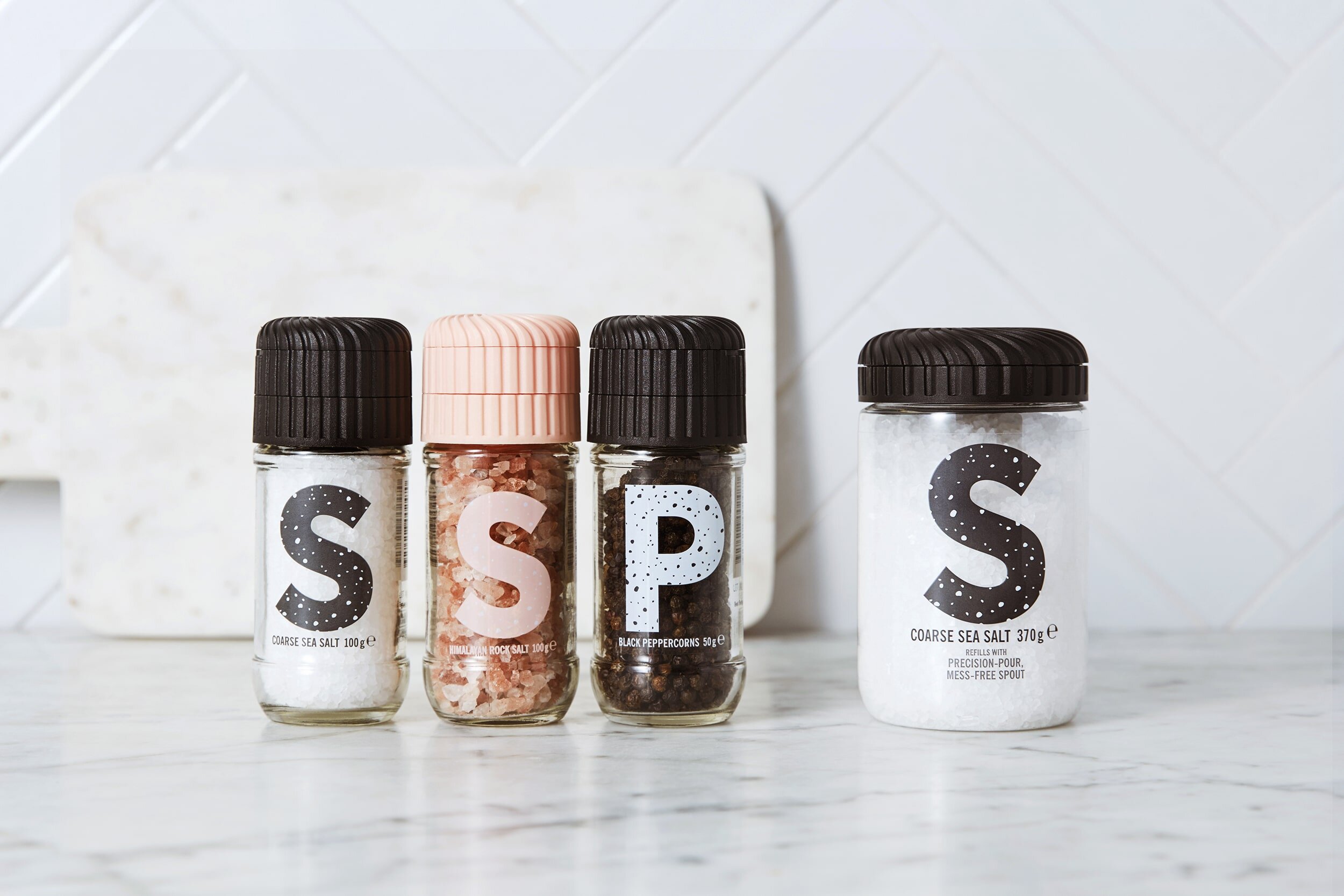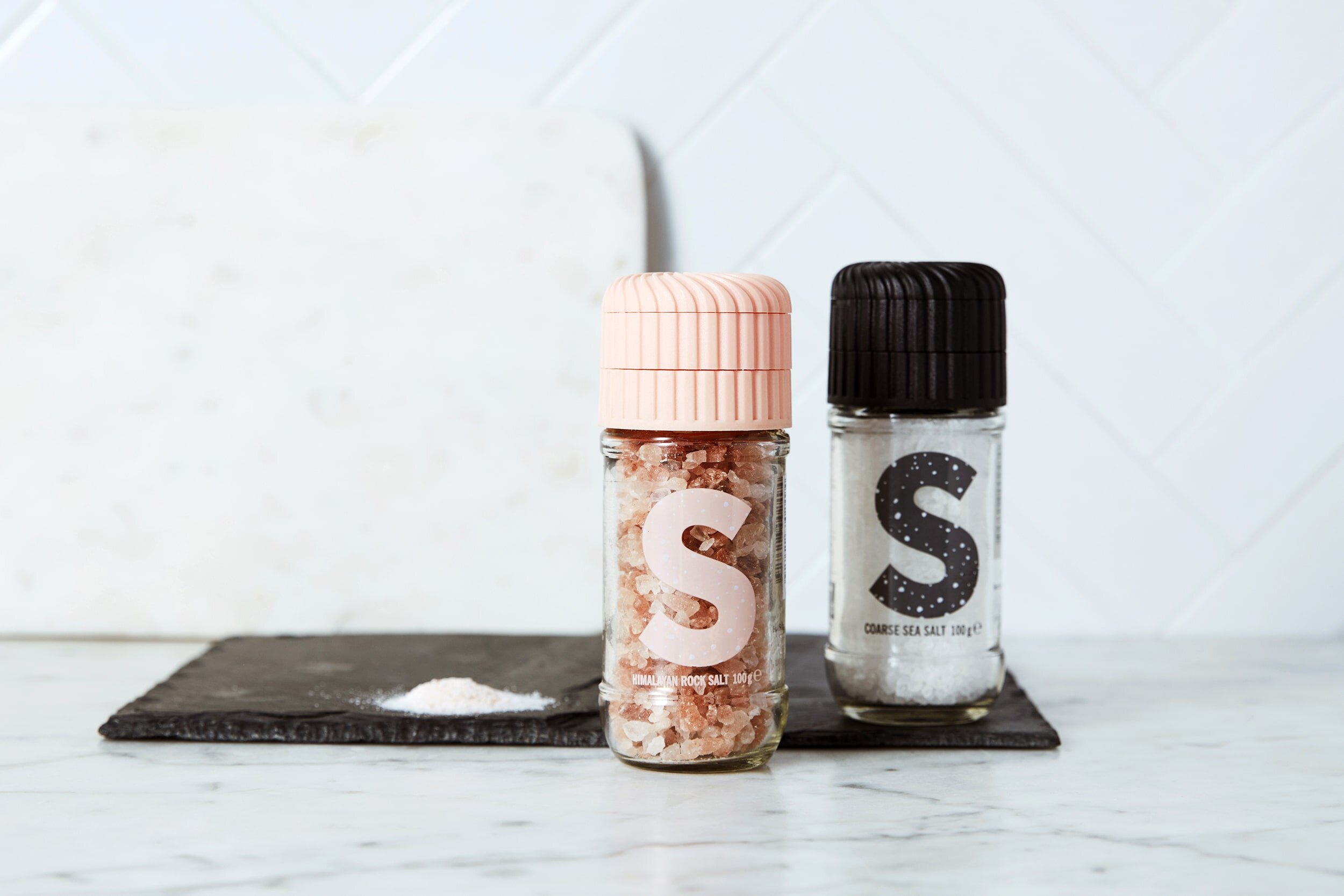
Simple. Effective. Eye catching.
As one of the first salt and pepper grinders available in the supermarket, Natural was a category leader. But over time, as more and more brands copied their simple plastic packaging, the category began to be dictated by price. And it felt like a race to the bottom.


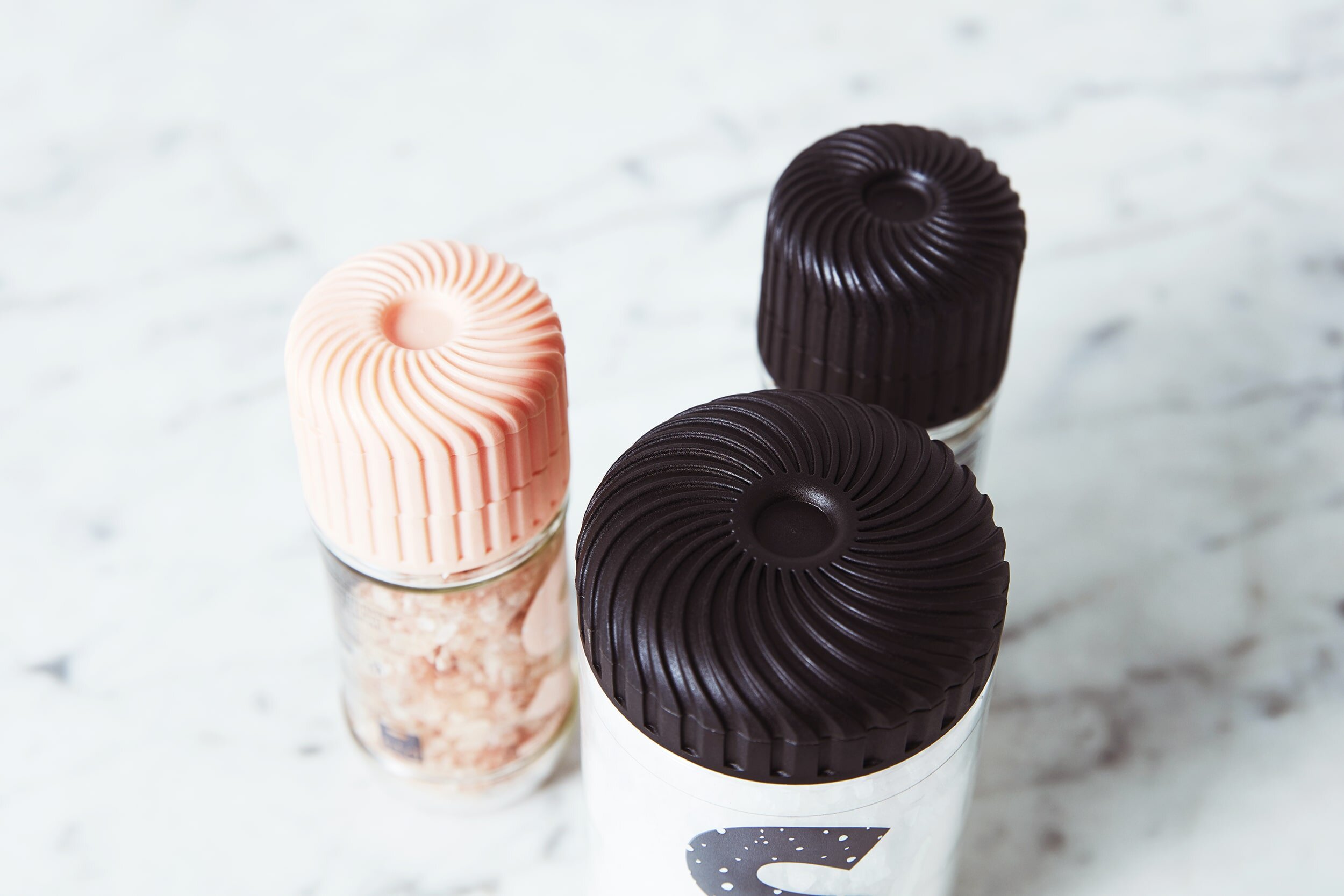
I helped to strip back the packaging with minimal text and no logos – a highly unusual approach in FMCG packaging, where loud, large logos seem to be the norm! Instead, a bold S and brazen P were introduced. This approach provides great visual appeal with bold blocking when stacked together on the shelf in the supermarket. To add to the visibility a Clevergrind grinder head was also designed.
Logo ⟶ Packaging ⟶ Presentation Templates


